top of page

LOGO DESIGNS
I helped finetune a logo for a startup company’s project called MedMind using Adobe Illustrator.
Design brief & direction :
1. brain shape
2. the star (or other shape suggestions) in the brain
Usage: corporate level, rather than product logo
Message: professional, high tech, related to the brain, reliable
 Original Draft Given- subtle hint of a star symbol - geometric shapes - simple and random overlapping lines |  1st Draft- tidier and more complicated lines - regular and more obvious star shape - light blue colour | 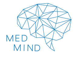 2nd Draft- simpler lines - irregular star shape - deeper blue colour |
|---|---|---|
 3rd Draft- simpler lines - star ➡ medical cross symbol - gradient blue fill colour (metallic texture) |  Final Design- lines are a bit more complicated - no fill colour (more negative space) - gradient blue colour for the lines |
bottom of page